About the project
Atlanta Worldwide is a local vintage shop full of unique finds. They love seeing customers in-store, but also offer a limited selection of items online. The business was struggling with their website's poor user experience, which was driving potential customers away.
Through comprehensive research including heuristic evaluation, user interviews, and usability testing, I identified critical issues in navigation, product discovery, and overall site structure. The redesign focused on creating an intuitive shopping experience that would increase online sales while maintaining the vintage shop's unique character.
Atlanta WorldWide ReDesign
Details
Role: End to End UX/UI Designer
Timeline: 3 Week project
Tools: FigJam, Figma, Figma Slides, Chat-Gpt, Google Workspace, Slack, Zoom, UXtweak, Maze, Photoshop
Deliverables: User Interviews, Heuristc Evaluation, Usabitily Study, Competitive Research, Persona, Problem Statement, Prospective Site Map, Sketches, Wire Flow, Lo-Fi & Mid-Fi Wireframe, Hi-Fi Prototype
The Process
How might we create an intuitive e-commerce experience that makes vintage shopping online as enjoyable as browsing in-store?
🔍 Heuristic Evaluation
I started with a comprehensive heuristic evaluation to understand the site's usability issues:
Home page and shop page were indistinguishable
Several category pages contained no products
Missing UI patterns for current location indication
Inconsistent navigation structure throughout site
👥 User Interviews
I conducted 3 user interviews to understand e-commerce shopping behaviors:
"I like to shop online for the convenience, but if a site is confusing I will just go somewhere else"
"If a website has product info, reviews, and good pics, I'm cool with buying from there"
"Some product descriptions can get too long and confusing, so I just skip them"
Research & Discovery
Understanding the problem through multiple research methods
⚠ Confusing Navigation
Home/Shop page confusing
Users couldn't distinguish between pages or find products easily
🔍 Empty Categories
Multiple product pages with no items
Users encountered dead ends when browsing categorie
◎ Poor Visual Hierarchy
Overwhelming product descriptions
Misaligned imagery and inconsistent text placement
Primary Persona
Glen
Photography Enthusiast
Problem Statement: Glen wants an easy, reliable way to shop online at his local photography store, so he can spend more time taking photos.
Initial Usability Testing
Testing the current site to understand user behavior and pain points
⚠ Home/Product page distinction was confusing and unclear
Competitive Analysis
Learning from successful e-commerce patterns and vintage shop competitors
Current Atlanta Worldwide
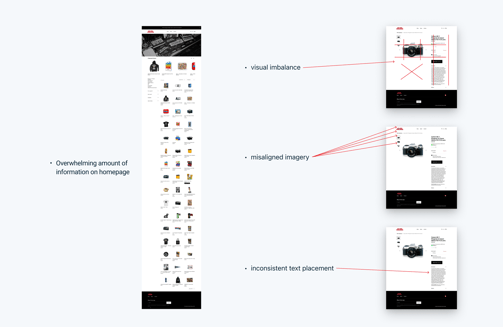
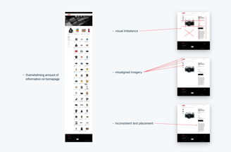
Overwhelming amount of information on homepage
Visual imbalance
Misaligned imagery
Inconsistent text placement disrupting flow
Successful Competitor
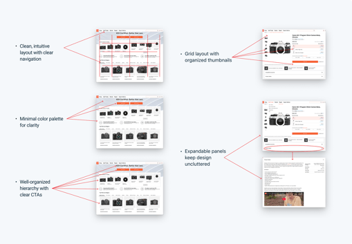
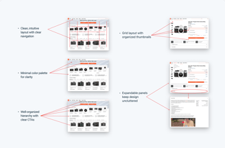
Clean, intuitive layout with clear navigation
Grid layout with organized thumbnails
Minimal color palette for clarity
Well-organized hierarchy with clear CTAs
Expandable panels keep design uncluttered
Information Architecture
Reorganizing content through card sorting and sitemap creation
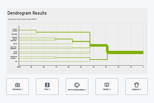
◎ Card Sorting Results
I conducted card sorting to better organize miscellaneous items like T-shirts, Tote bags, and Bobbleheads that didn't fit into existing categories.
New Category Structure:
Cameras
Film
Art & Collectibles
Media
Apparel
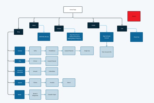
🔍 Improved Sitemap
Created a prospective sitemap with clear main pages and logical categories and subcategories for all products.
Home
├── Shop (with clear categories)
├── Product Details
├── Cart & Checkout
└── Contact & About
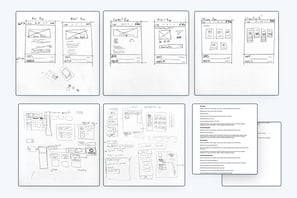
Design Process
From rough sketches to high-fidelity prototypes
Sketching
Started with rough sketches to get ideas out and plan page layouts with detailed notes.
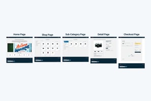
Hi-Fi Prototypes
Developed detailed prototypes with proper navigation, filtering, and interactive elements.
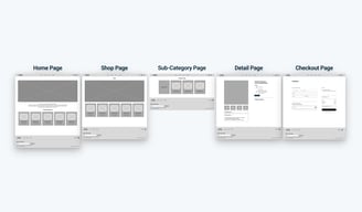
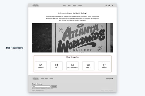
Lo-Fi Wireframes
Created basic wireframes in Figma to establish layout structure and user flow.
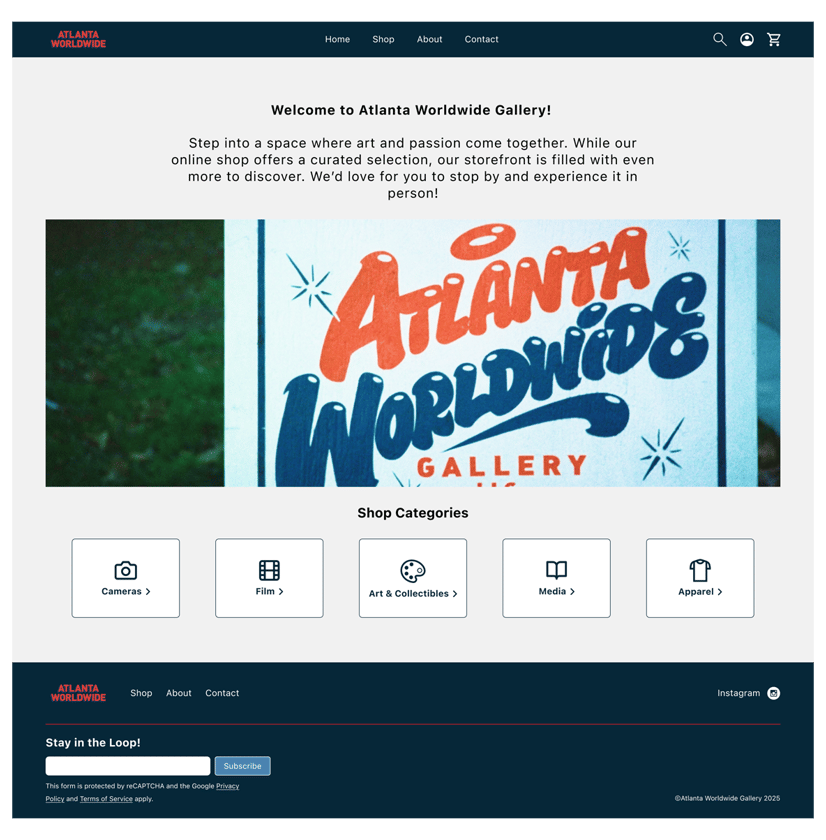
The Solution
Key improvements that transformed the shopping experience
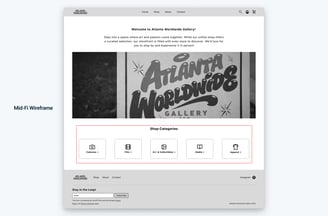
Enhanced Homepage Navigation
Created clickable category boxes on the homepage, making product discovery intuitive and eliminating the confusion between home and shop pages.
Clear category distinction with visual hierarchy
Clickable category boxes for easy navigation
Consistent layout patterns throughout site
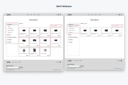
Smart Filtering & Organization
Implemented dropdown subcategories, sorting features, and a clean grid layout to help users find exactly what they're looking for.
Dropdown subcategory filtering
Sort by price, popularity, and date
Responsive grid layout for all devices
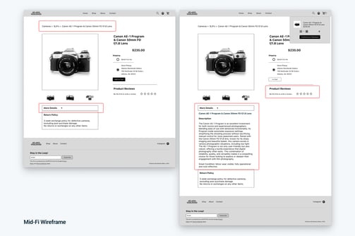
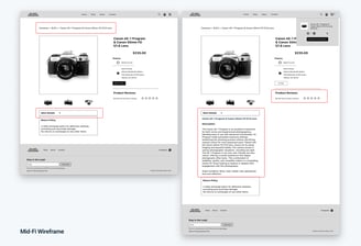
Improved Product Pages
Added breadcrumbs for navigation, collapsible detail sections to reduce overwhelming content, and dedicated review sections to build trust.
Breadcrumb navigation for easy backtracking
Collapsible details prevent information overload
Dedicated review section builds customer confidence
Prototype Testing Results
Testing the mid-fidelity wireframes with 12 users
✅ Success Metrics
100%
Task completion rate
All 12 users successfully completed the shopping task from category selection to checkout, demonstrating the effectiveness of the new navigation structure.
⌖ Areas for Improvement
51.4%
Misclick rate
Users attempted to interact with non-functional features like search and sort. This taught me to better communicate prototype limitations during testing.
Key Learnings
Insights gained throughout the design process
👥 User Research is Foundation
Starting with heuristic evaluation and user interviews provided crucial insights that guided every design decision. Understanding real user pain points prevented designing solutions for non-existent problems.
📝Clear Communication in Testing
The high misclick rate taught me the importance of clearly explaining prototype limitations to test participants. Next time, I'll provide better context about which features are functional versus static.
💡 Information Architecture Matters
Card sorting revealed that users have strong mental models for product categories. Organizing content to match user expectations dramatically improved navigation success.
Next Steps
Recommendations for continued improvement
Enhanced Search Functionality
Implement the search feature that users expected, with autocomplete and filter suggestions to improve product discovery.
Mobile Optimization
Conduct mobile-specific usability testing and optimize the touch interactions for smaller screens and thumb navigatio


✅ What Users Liked
⚠ Pain Points Discovered
✅ Simple and clean layout gave a professional impression
✅ High-quality product images built confidence in purchasing
✅ Contact page provided clear directions with map and store hours
⚠ Lengthy descriptions were overwhelming and unclear about quality
⚠ Product pages required too much scrolling to find information


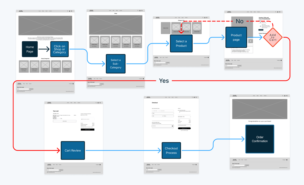
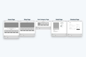
Wire Flow
Start simple task to preform on the wireframe of the site.


The Prototype
Critical Issues Identified
Through comprehensive analysis, I identified three major pain points affecting user experience